Any graphic designer who intervenes will need to master and visit the wonderful universe of typography at some point. In this article you will find a series of practical typographic tips that will help us with its use.
Typography is a visual element of graphic design and fonts that always takes centre stage in our compositions, because among other things it supports a large part of the message we want to communicate.
For this reason, to avoid unforeseen events with fonts, it can be positive that we follow, as far as possible, a series of practical typographic tips for its use.
Some of these tips are closely tied to the mistakes I cited in the previous article 13 Typos You Should Be Careful Not to Make. So, if you are a faithful reader of my blog, surely you will not be taken by surprise.
5 practical typographic tips to use typefaces correctly
- Use capital letters well
Here’s another typographic tip that you might not have considered. With the arrival of social networks and the use of apps in recent years, writing in upper case or capital letters to highlight concepts or words has become a common practice.
You should know that in a more informal use, capital letters can be aggressive and be interpreted as raising the tone of voice. Always capitalize sparingly and with purpose. For example, you can write titles in all caps to help with the visual hierarchy of your composition. On the other hand, making use of capital letters for text paragraphs can end up making it difficult to read. Use of sans serif font is best for your typo visual.
- Use good font families
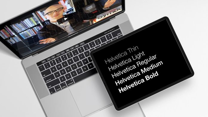
Font families are fonts that have different versions with which to work. They all have a series of characteristics and a common style. That is why we managed to identify them as belonging to the same family.
A font family includes fonts with different font variables (weight, width, or slant): thin, bold, ultra-bold, italic, condensed, etc. This allows us to have more freedom to establish a correct visual hierarchy or to contrast concepts or words.
- Consider typographic personality
All typefaces can evoke emotions. The set of sensations that they can transmit to us is called typographic personality. Fonts can be playful, serious, informal, elegant.
For example, if we use a tall and narrow sans-serif font, it is very likely that it conveys elegance. If we use rounded or thick sans serif fonts, they will be more cheerful and fun. On the other hand, handwritten or ornate typefaces can convey celebration or fantasy.
But if you want to learn more about the typographic personality, do not miss the article where I develop this concept in more detail: Typographic psychology: what it is and what we must take into account.
- Align by default to the left
Another of the typographic tips that is worth evaluating every time we use fonts. Whenever possible, avoid centre-aligned text, or justified alignment. We know it can be tempting to use centre alignment, because it’s a symmetrical alignment, but you should know that this alignment makes reading difficult.
When reading with this type of alignment, our eyes have to strain to figure out where the next line of text begins. In contrast, with left alignment, the eye knows exactly where each new line of text begins. With the alignment to the left, our eye will form an imaginary line on the left edge of the text. Thanks to it you will be able to find the beginning of each line of text, maintaining the connection with the reading of the paragraph.
On the other hand, many graphic designers have a preference for justified alignment. Although it is visibly more orderly, this type of alignment causes irregular spaces between words and once again makes it difficult to read the text.
So, remember, whenever possible, make use of left or right alignment for texts.
- Make use of ligatures
In typography, ligatures are glyphs that contain pairs or triples of characters. They are designed to count as a unit when written with the typography.
At the time, ligatures originated from the need to save manual effort, when the mechanization of writing did not yet exist. Today they can also be used to give an aesthetic value to the text. They will give more harmony and fluidity to the word.


